During the summer of 2022, I participated in an internship with EHE Health- a national leader in preventive health exams. As the Creative Intern, I owned a variety of projects that are featured below.
(Nearly every project that I embarked on was done independently- with the exception of my work on paid search ads. These ads were designed by senior creative team members, and my role on the project was to resize and animate them.)
(Nearly every project that I embarked on was done independently- with the exception of my work on paid search ads. These ads were designed by senior creative team members, and my role on the project was to resize and animate them.)
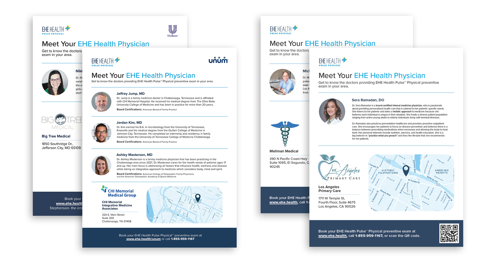
“Meet the Provider” one-pager—
a redesign of an older sheet that is given to customers prior to their EHE Health exam. The original sheet was not updated to reflect our current brand image.
“Physical Exam” one-pager / poster- a redesign (see original on the left/above) of a handout and poster to be distributed and hung up in EHE clinics across the U.S. that instructs users on how to prepare for their EHE Physical Exam


Zine / Evergreen content—
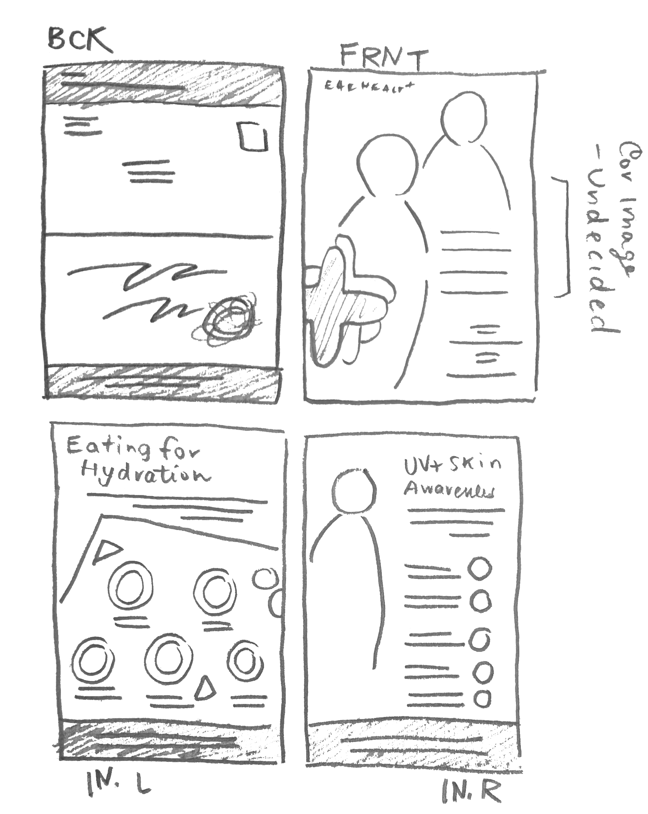
each month our customers are sent direct mail and email newsletters, which I was given the opportunity to design for the months of July, August, and September.
The format of the text on the cover & back of the zine were templatized, but all stock photography was chosen by me, and all interior design work was created by me alone.
The format of the text on the cover & back of the zine were templatized, but all stock photography was chosen by me, and all interior design work was created by me alone.


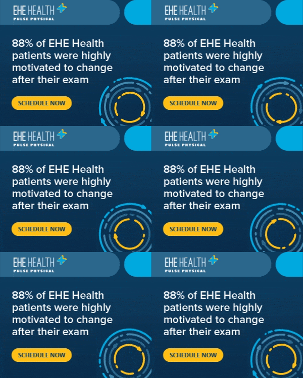
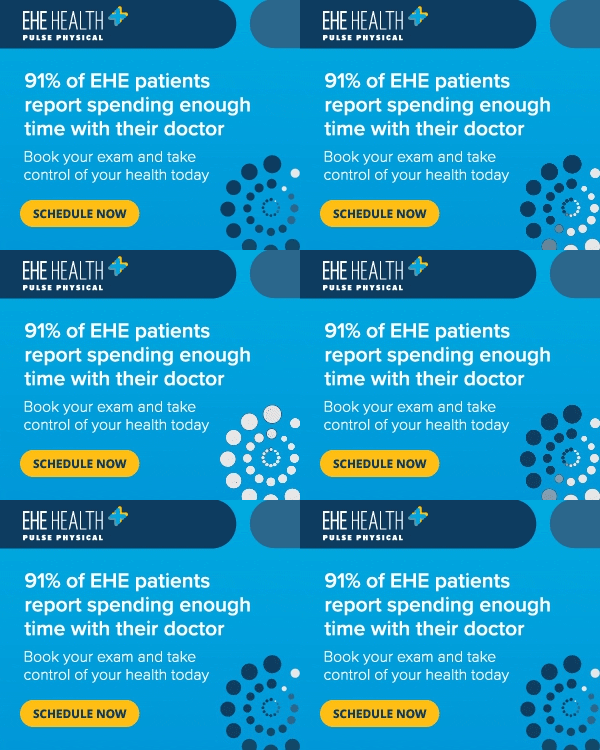
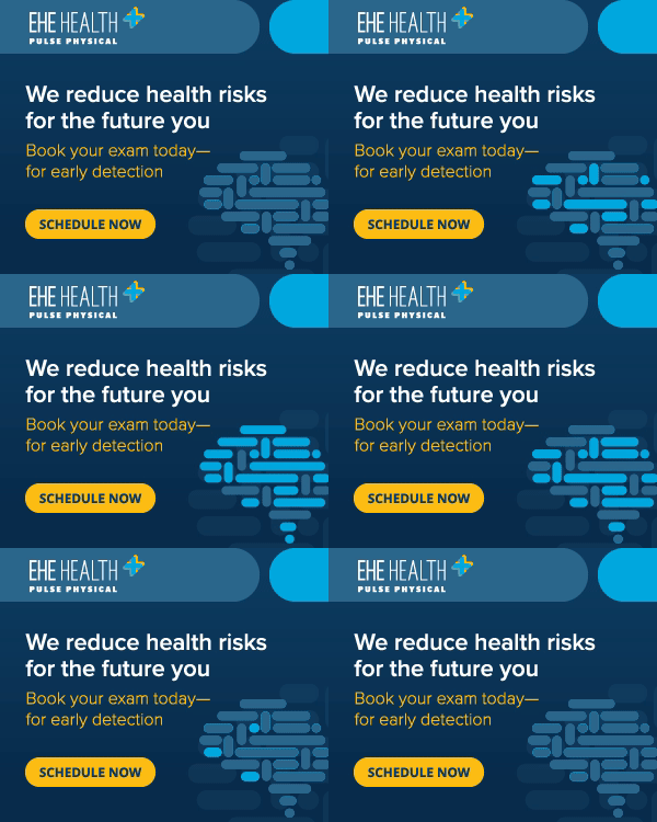
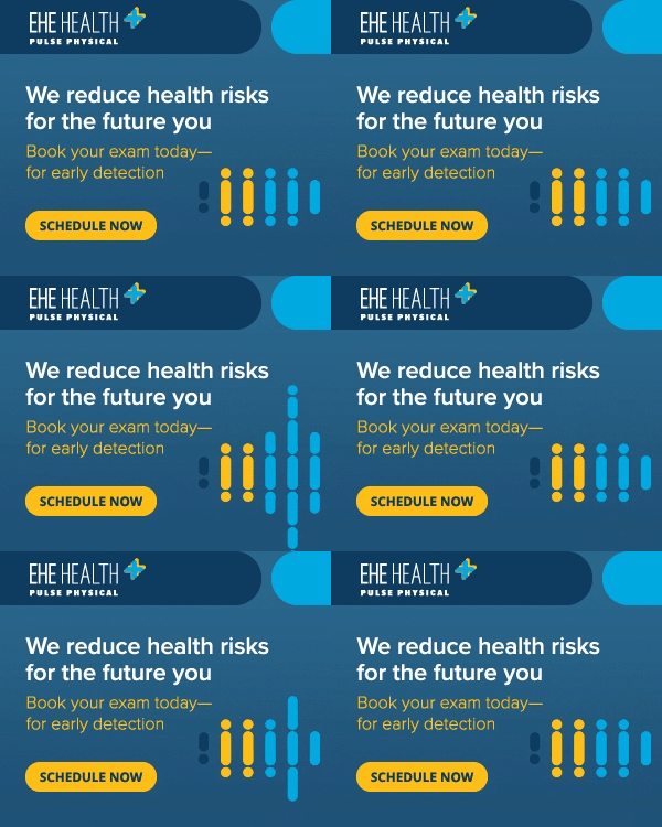
Paid Search Ads- over the course of three months, I was tasked with re-arranging, re-sizing, and animating hundreds of paid search ads. The copy was sourced from our amazing copywriting team and a senior designer would pass along a base design to me. I would reference this original design in order to create dozens of new static and animated versions. The animations in this example were all ideated, planned, and executed by me using Adobe After Effects.


Nurture email— an email sent to customers after they complete an EHE exam had to be redesigned and updated with our brand image; I had to create a new layout, including new images, header, modules for our app / other services.


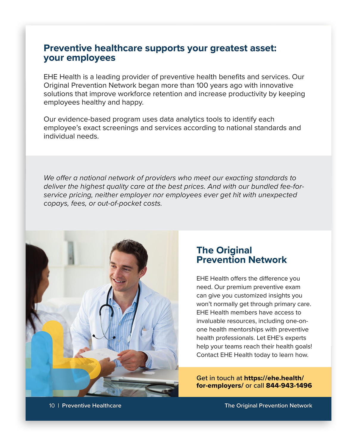
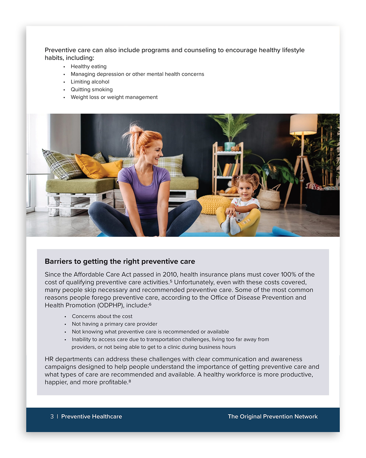
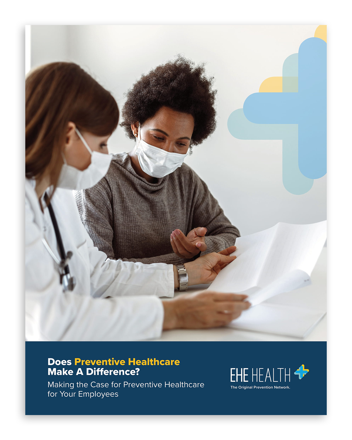
White paper- in order to draw new clients, EHE health has been planning and launching research papers targeted at corporate professionals; I designed the first three of these to ever be released on our website.




On most days, my bus commute into NYC would be filled with sudoku and NY Times crossword puzzles, but a few times I brought along my sketchbook to document the morning ride into the city.


